| PRODUCT | SUPPORT | DOC |

|
A few words from our CEO |
|
"The version 7sp2 we've just delivered is a maintenance version. It's full of new features though!
Among the new features, we simplified a lot the UX by including in the 'Details' tabs many information that used to be in separate dedicated tabs before.
Next step will be to get rid of the Submit/Cancel buttons :)"
- Eric Gavaldo |
NEWSUser Experience SimplificationWe used to have many tabs on some specific items such bugs. TabsTabs provide a nice way to show selected or associated items directly in their tree. Seeing items in their context (in this case a structured tree) is always a plus for clarity.However, the cons of this is you must browse different tabs to see all the information related to the current item. And the drawback of it is you need to click many times... too many. Flat list, drop-down menusConversely, using flat list is simple, take only a few space (so can be integrated in a single panel) and hence is click-thrifty.However, it is less flexible and provide less visible details on the selected elements. The best of both worldsTo conciliate pros of both solutions, we've just introduced in XStudio.web 7sp2 a new widget that will be integrated in the main "Details" tab and that will "proxy" the selection task to a dedicated GUI.
This allowed removing many tabs from the right-hand side panel without losing the important information you need.
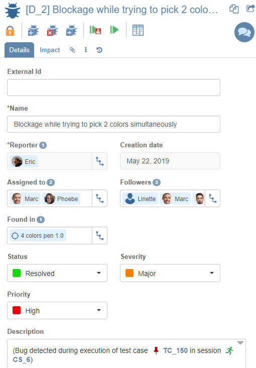
For each former tab that can be replaced with the use of this widget, you now have a new field in the "Details" tab providing all the necessary information about:
As an example, let's pick a bug. This bug has a reporter, a couple of people assignees and a few followers. It must also show which version(s) the bug has been found in and which version it has been fixed in. All those information where formerly available in 5 separate tabs. They all have been removed from the GUI and it's now much simpler:
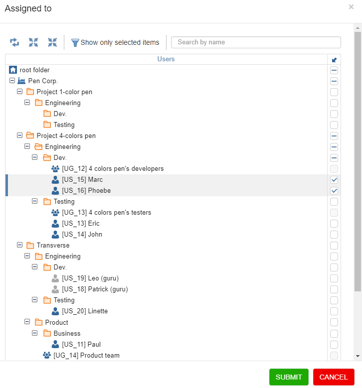
Indeed, the popup will let you see the currently selected people in their context/tree - and eventually change that selection if you wish to.
Downgrade & update policies You probably remember that we added in v6 the ability to configure Downgrade and update policies at requirement level to define what happens to your tests if a requirement is modified or downgraded to an inferior status. For example, you can send a push notification and post a message to all linked tests (so that all contributors to those tests are alerted and can double-check if an action is necessary). You can even downgrade automatically all those linked test's status too if you wish. In version 7, we also added the same feature at test level to define what happens to your testcases if a test is modified or downgraded to an inferior status. You have several choices including:
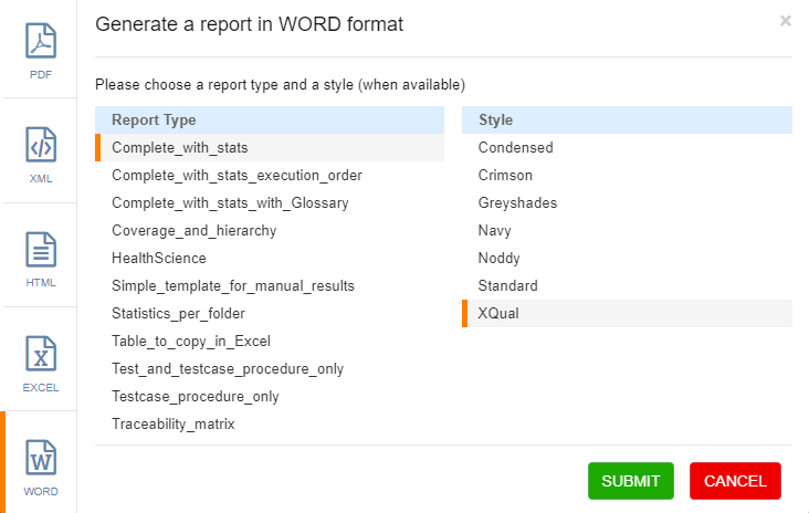
You'll never have any longer tests or test cases that lost their sync with their 'related parents'! Reports in Word format A new output format has been added when you generate a report. Now the complete list includes PDF, XML, HTML, Excel and Word
New message triggers email Posting a contextual message about an item (SUT, requirement, specification, test, testcase, bug) now also sends an email to all contributors on this item. Email's title have been designed so that the users can easily filters those emails using their email reader if needed. The contents of the emails have also been improved and they are now supporting embedded images.
...and as always, all those wonderful features work on ANY browser |
ROADMAPXStudio 8 developments are starting now. The plan is to have a beta version ready in 6 weeks.Please check our roadmap for more details. |
EVENTS
XQual is happy to be Premium Sponsor of the JFTL 2022 Conference (Journée Française des Tests Logiciels).
|
TIP OF THE MONTHYou can find in our documentation section a nice white-paper about Timeboxed exploratory testing. |


